Wednesday, April 28, 2010

Map of the Week


This map shows a strip of desert between Sudan and Egypt called the Bir Tawil Triangle. The Bir Tawil Triangle is significant because it is the only land on earth that is unclaimed by any country.

Bivariate Map


For the bivariate map I chose vacant homes as my proportional symbol and population as my chloropleth symbol. This allows readers to see what areas of Buffalo had the highest number of vacant homes, and compare that to the highest populated areas. I chose houses as the symbol because it gets the point across yet doesn’t clutter the map too much. For the colors I chose a gradient of greens.

Proportional Symbol Map


The world cities map shows the world capitals that have populations greater than 750,000. Since it’s a proportional map I made sure to select a symbol size that allows the smallest cities to be seen, yet doesn’t make the largest cities crowd the map. I also decided to add a drop shadow to the legend to make it stand out.

Dot Map


The dot map shows the distribution of vacant homes in Idaho. I selected 75 for the value of the dots because it doesn’t crowd the map, yet it still shows a good level of detail.

Wednesday, April 14, 2010

Map of the Week # 2


This map shows us how much of the moon man has actually explored on foot, by putting it into an associatable context. I had no idea how small of an area Neil Armstrong and Buzz Aldrin actually covered!

IDW vs. Kriging


This map compares two interpolation methods, inverse distance and kriging. The kriging map appears more smooth and less detailed in this case.

Inverse Distance Map


This map shows the precipitation grid of Idaho using an inverse distance interpolation method. IDW is an interpolation method that lays a grid over the points we already have data for (the control points) then interpolates the values of the grid by taking into account the values of nearby control points. Like the last time I exported a map as a jpg the border of the map is not showing. I have no idea why this is.

Thursday, April 8, 2010

Classification Methods


I decided to make this map portrait style the second time around to fill up more white space. I also added labels to clarify which classification method was used. My new title is more specific and the subtitle makes it clear that the comparison of classification methods one purpose of this map.

Freehand


The new map has a smaller, yet more descriptive title, so it doesn’t take too much from the features. I labeled Indian Peaks National Park as per the instructor’s request and I added the source information to the credits. I also made the map a feature a tan color so it stands out from the page better.

River Generalization


When I redid this map I decided to put all three simplifications on top of each other, because that way one can actually tell if and where the methods vary. I also changed the title and added a legend, neatline and credits. The new title is a little more specific and descriptive.

Nez Perce Land Map


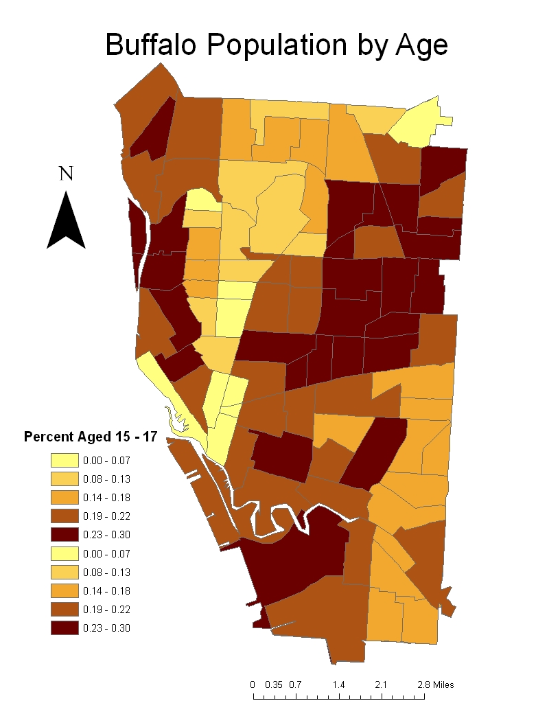
I didn’t make any changes to this map. I really didn’t have time. After losing my only copies of all these files and having to redo each map from scratch it was a big struggle just to finish the other maps. I think this map is pretty good, but if I were to make any changes I would probably move the scale bar above the legend and put a white halo around the title so it is easier to read.

Quantitative Map


As before, the map on top is the original and the map on botom is the improvement. I made sure to format it the exact same as the qualitative map. I think it gives them a more professional look. I cleaned up the legend and scale bar and added credits and a neatline. I also moved the north arrow to a better location at the bottom right of the map. I think the title and legend title of the old map did not make it clear exactly what was being expressed, so I changed them.

Qualitative Map


The top map is the original and the bottom map is the improvement. When I looked over the jpg from my old map, I noticed a big mistake. I made the map way too small without realizing it. This time I made sure to make everything cover the whole page. I also changed the word dominant in the title to predominant. Dominant evokes an image of one race having dominion over another, which isn’t what I’m trying to portray. I moved the north arrow and added a neatline and credits, as well.


Wednesday, April 7, 2010

Map of the Week

This map is no cartographic masterpeice, but it tells an interesting story. It matches US states with a country with the most similar GDP. The data from this map is a few years old (2007), but it really puts the size of the US economy into perspective. For instance, Bangladesh has a similar GDP to New Hampshire despite the fact that it has about 120 times more people.

This map is from www.strangepress.wordpress.com.
For a complete list of the GDP's of the featured countries and states you can go to http://strangemaps.wordpress.com/2007/06/10/131-us-states-renamed-for-countries-with-similar-gdps/